
Development Log: Event Posters
Tuesday, September 02, 2014
Here is a retro screenshot of Bee Docs Timeline version 1.0 running on Mac OS X 10.4 Tiger.
At that time, events could contain an event title and dates. Other information such as notes, images, movies, links, and tags were added in later versions. As I mentioned in my previous post, the user interface was designed around those initial requirements.
When I added the ability to use notes and media, almost everyone took advantage of those features. In fact, people took advantage of those features to a degree that I did not initially expect.
As I have provided e-mail support to customers, I have seen hundreds of timelines. Many of those timelines use notes that are paragraphs long. Notes that are about as long as a printed page in each event are not uncommon.

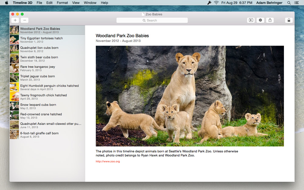
A graphical timeline chart must trim or scale down this data in order to display it efficiently together with other events, so it has become important to have an additional way to view and edit your events. It is with this in mind that I developed the Event Poster view.
This view shows all of the information associated with an event in a layout that is optimized to fill the screen, minimize scrolling, and feature your event media. You can quickly flip through your events with a swipe or using the arrow keys.
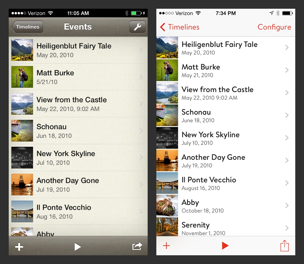
The Event Poster view also is designed to adapt to a huge range of screen sizes. For example, the iOS version scales between the iPhone and the iPad in different orientations.
This view also presents your events beautifully on any Mac screen. Here is a screenshot of Timeline 3D running on a Mac OS X Yosemite at 1280 x 800:
I originally wrote the layout code for Event Posters when I designed the iOS app several years ago. At that time, it was manually coded layout logic. For the iOS 7 release, I migrated the layout code to use Apple’s auto-layout technology instead. For the Yosemite release I am using the same auto-layout structure, but tuned for the fonts and screen sizes available on the Mac.
The principle that it takes a lot of complexity to make something simple definitely holds true here. There are over 70 layout constraints involved in determining the layout. Many of them change priorities or values based on the contents of an event (for example, the aspect ratio of the event media affects the line wrapping of the notes).
The result is that your content looks beautiful and readable on any screen!

Labels: design, development, Event Posters, timeline 3D
Development Log: Content and Presentation
Saturday, August 30, 2014
Ten years ago, Bee Docs Timeline was born out of the idea that a member of a legal team could record events as a witness was describing them and then show the resulting timeline chart to the witness for confirmation. Two main parts of this challenge appealed to me as a product designer. First, quick real-time entry of the data. Second, a clear and professional presentation of the data that did not require lots of tweaking.
Both of these activities remain central to the design of Timeline 3D. The upcoming release will have a new interface design that further clarifies and reinforces these features. In order to understand the coming changes, I first want to review the design of the software as it exists today.
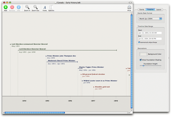
Here is an image of the current version of Timeline 3D for OS X (v3.9):

The main layout of interface has stayed basically the same for the past ten years. A layout of your timeline fills most of the window. This graphical presentation dynamically adapts to the contents of your document as well as the size of the window.
Double-clicking an event reveals an edit form that allows you to add or edit information like the event title, date, and media. You are responsible for that information as well as the date formats, colors, font size, and image sizes. The software is responsible for finding the best way to position everything in the timeline based on the these settings.
This structure had many advantages over timeline product that came before it. Notably, it removed the time consuming task of arranging event positions and tick marks. It also looks nice and works great for timelines where most of the events fit on a single screen. In the beginning, before event notes and media were an option, most of the timelines that customers created did fit on a single screen.
However, there are some down sides to this arrangement. It muddies the division of responsibility between the software and the user. When you want the timeline layout to fit more compactly, it involves changes to the timeline elements so that the software can change the timeline layout. This is confusing to many people at first.
The whole structure of editing your data within a dynamically changing timeline chart also does not scale very well. If you have one hundred events, for example, changing the date of an event may cause it to move completely off screen as the layout adapts. Then you need to go scrolling to find it.
Furthermore, the layout logic is complex behind the scenes and may take a few seconds to computer for a large timeline. The software can feel sluggish when it is constantly calculating the layout as you edit your content.
Finally, screen sizes on Apple products were fairly predictable when I introduced Timeline 3D. Now, the screens you work with every day can cover a huge range. Everything from a 3.5” iPhone to an 11” MacBook Air to a Mac Pro with multiple 4K displays.
The existing layout works well for very large displays, but it involve lots of side scrolling on the smaller displays which represent Apple’s most popular devices.
In the next Development Log, I will introduce a new design paradigm that addresses these issues in the upcoming version of Timeline 3D for OS X Yosemite.
Labels: design, Development Log, timeline 3D, Yosemite
Better Depth in Timeline 3D
Tuesday, August 27, 2013
We are announcing some exciting new features in the upcoming version of Timeline 3D for iOS 7.
We also improved the features that you are using already.
Most importantly, we improved the way that your timelines look and the feeling of depth in a 3D presentation. These improvements will make your timeline more beautiful and easy to read, both on your device screen as well as when connected to an external display.
“Depth” is a key concept that Apple has been pushing for iOS 7. There are two main features I've added which will increase the feeling of depth for your timeline presentations.
Lighting — The Mac version of Timeline 3D implemented lighting and shading several years ago, but the iOS version has used constant shading to date. In the new version of Timeline 3D for iOS, I've designed a new lighting effect that is a huge improvement over the previous iOS software and is even better looking than the Mac software (we plan to bring these improvement back to the Mac in a future release).
The new lightning effect gives greater emphasis to the highlighted event and enhances the feeling of depth in the overall timeline by brightening that event and shading the background.
In the Mac version, we accomplish a similar effect by multiplying a vignette effect over the timeline. This causes the image to darken around the edges. We vary that effect as the timeline is rotating, so it tricks your eye into believing that the shading is caused by lights. This method is a very fast way to simulate lighting.
However, the layering approach has some technical downsides. First, the selected event can not fill a large percentage of the screen without also being affected by the vignette. Also, the vignette does not work as well at portrait aspect ratios or long and skinny aspect ratios (it is optimized for Mac screen sizes). Finally, the vignette can not work along the sharp edge of an event, so we lose an opportunity to make the selected event “pop” off the background.
For the new iOS 7 release, I calculated the trigonometry to do the actual lighting that we desire. We want the selected event to be 100% lit, the background to fade to a pre-determined amount when it reaches the right edge of the screen and we also want it to work for all render aspect ratios and all chart aspect ratios.
The trigonometry works, but some devices (like the iPad 3 retina) can not calculate it at 60 frames per second. The iPad can do the calculation at 30 frames per second, but after much soul searching, I had to admit that a consistent 60 frames per second animation is more important than the shading effect.
I was about to give up on the lighting improvements when I learned about a value in OpenGL that is adequate for this calculation and is generated by OpenGL's normal pipeline. I simplified my formulas using this value and now we have a beautiful depth lighting effect that can run at 60 fps, even on the most GPU challenged devices.
Parallax — Have you see the parallax motion effect in Apple's iOS 7 intro video? Pretty cool, huh? It makes the buttons on your home screen stand off the wallpaper. Well, we've leveraged that technology to make your timelines look more 3D too. As your iPhone or iPad moves in your hand, the 3D timeline also shifts subtly to reinforce the feeling of depth.
Since releasing the original version of Timeline 3D for Mac five years ago, I have made dozens of subtle changes to the way 3D timelines are displayed. Nearly every update has contained updates to the 3D display. These were improvements to positioning, movement, lighting, shadows, coloring, lighting, and performance.
Each one of these changes may have been hard to detect on it's own. In fact, I have tried to tune each of them down to be just at the edge of perception. Did you notice any? When the changes are considered as a whole, however, the improvements are obvious.
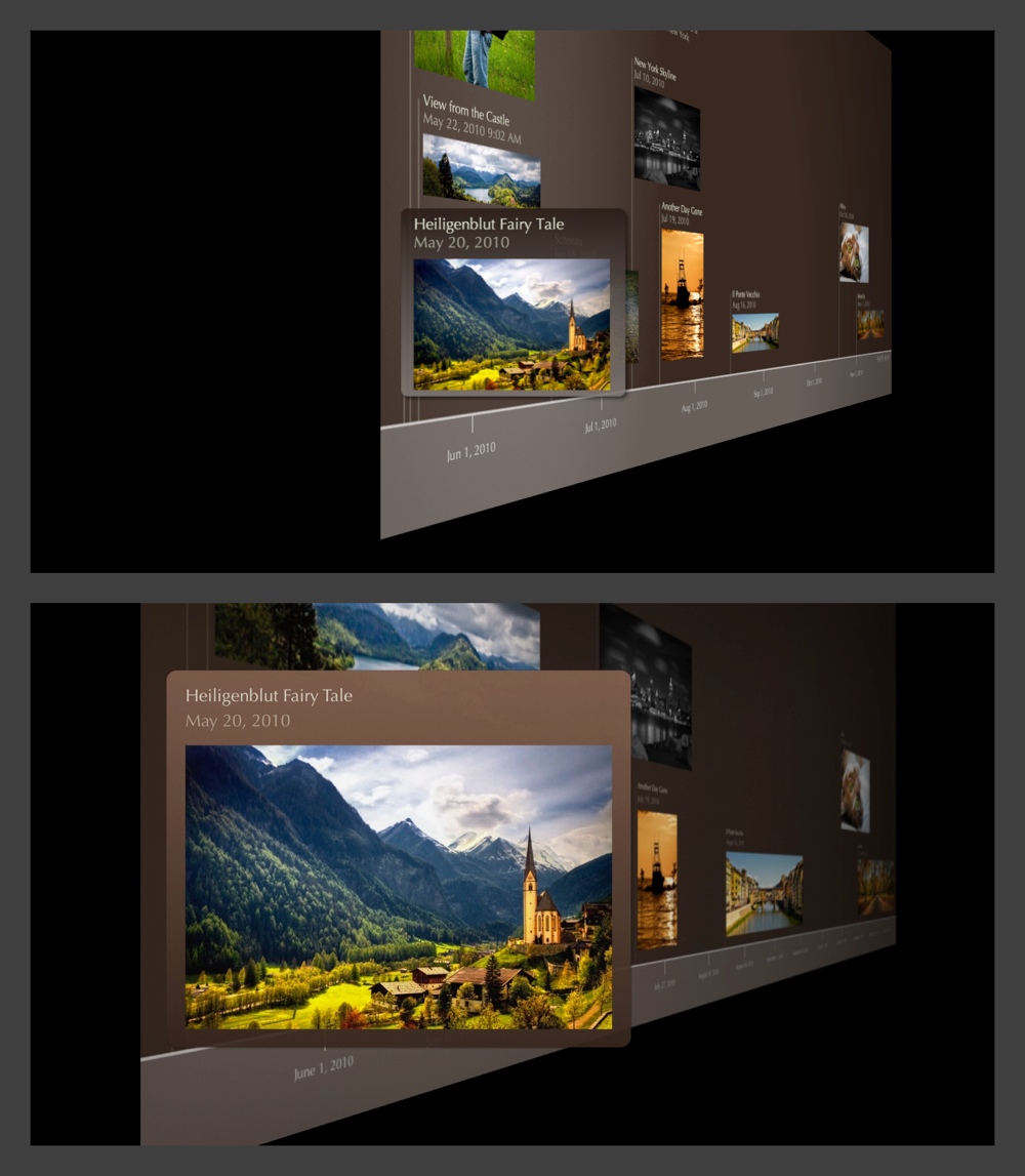
Consider the comparison image below. The top version is Timeline 3D v2 for Mac OS X, the version that was recognized at the Apple Design Awards in 2008. The bottom version was generated on an iPhone with the upcoming version of Timeline 3D for iOS. Click on the image to view it at full size.
Labels: design, ios7, OpenGL, timeline 3D
iOS 7 – Less Volkswagen, more Vanity Fair
Monday, August 19, 2013
In a few weeks Apple will be launching iOS 7. We will be releasing a brand new version of Timeline 3D, redesigned specifically for iOS 7. I wanted to share some thoughts on what the new design direction from Apple means to me.
There has been a lot of talk about new icons, thin fonts, and inspiration from other platforms. To me, these discussions are interesting in the way that Beyonce’s new haircut is interesting, but they are not the main point.
Do you remember the web in the early 90’s? Text content was king, hyperlinks were blue with underlines, and images were reserved only to those that were important to the content.
To me, Apple is encouraging us to look back to those design values. Going back even further, think of books that only use one well-chosen font, in black, on one well-chosen paper, in white, laid out with well-chosen spacing. The goal is that you will get lost in the story and forget that everything you see was carefully designed.
iOS 7 feels retro to me, and I like it. It has been fun to reexamine Timeline 3D over the past few months with this throw-back lens.
In iOS 7, I am less likely to be inspired by the dashboard of a Volkswagen, or the EQ sliders on my boombox.
I am more likely to be inspired by the layout of a Vanity Fair magazine or a small-press edition of a classic novel.
iOS 7 emphasizes:
- Font choices
- Positional Layout
- Color-coded meaning
- Movement
- App Functionality
- Just-in-time adaptable layouts
- Coherence across the system
iOS 7 deemphasis:
- Real-world metaphors
- Material simulation
- Color for decoration
- Designing for screenshots
- Fixed layouts
- Individualistic Style
That isn’t to say that all these things were not important before, and that all these things won’t have a roll to play going forward. But, iOS 7 makes a clear call for a change in emphasis.
Here are some iPhone examples of how I have redesigned Timeline 3D using these concepts as a guide. My opinion is that the new design is more useful, more efficient, and more beautiful. I hope that you will love it too!

Beauty is Skin Deep - Web Looks
Wednesday, January 05, 2011
Our upcoming web timelines are decidedly simple in layout and navigation. They are designed from the ground up to function in a small space such as an iPhone screen or embedded in an article.
They are also designed to be intuitive to your audience who perhaps has never encountered an interactive timeline on the web before. For example, all the events can be accessed without zooming or scrolling.
However, simple doesn't mean that they can't be beautiful as well.
We were very fortunate to work with Mani Sheriar, from the Bay Area, who designed some beautiful looks that can be applied to your interactive web timelines. Here is a sneak peek of one we call "Vintage Shop - Sepia."

Simple and beautiful.
Labels: design, manisheriar, publishing, timeline
Bee Docs Timeline with Adobe Illustrator
Wednesday, March 24, 2010
When designing a new product, it is important to define “what it is” but it is equally important to define “what it is not.”
At the very beginning of Bee Docs Timeline, I decided that our software would not be a graphic design focussed application. What I mean by that is that it does not include many features for tweeking graphics and fonts, adjusting page layout, or modifying lines, shapes, individual words, etc...
Instead, I aimed to build software that would make very good looking timeline charts as simply and quickly as possible. I wanted to make a product that would make our customers look good, whether or not they had any graphic design skills.
However, there are certainly situations where detailed graphic design tweeks are critical. For example, Margaret and Phil Goodfellow recently told us about a book they authored that contains timelines, maps, and other graphics that all conform to the style established by the book designer. Here is an example of one of the timelines:

To build a graphic like this, the authors took advantage of the strengths of several different software applications. First, they used Bee Docs Timeline to enter and edit the events as well as to establish the basic layout of the events within the timeline.
Next, they exported the timeline from Bee Docs Timeline as a PDF and opened the PDF with Adobe Illustrator. In Illustrator they adjusted the layout to best communicate the content of their chart.
Finally, the authors sent the Illustrator files to their book designer who adjusted the visual design to match the rest of the book.
Congratulations to Margaret and Phil Goodfellow for publishing such a great looking book. It is a wonderful example of using multiple tools to build something that is greater than the sum of it’s parts. Hopefully it inspires everyone reading this to create something beautiful too!
More information on the book can be found at: www.contemporarytoronto.ca
Labels: book, customer, design, illustrator, timeline
New BEEDOCS Shirts
Thursday, March 18, 2010

We have a new t-shirt design for sale. These are black EDUN shirts with the BEEDOCS logo bleached out by hand. Each shirt is one of a kind. We only made a few of each size, so check them out today!
New Bee Docs Logo!
Wednesday, August 06, 2008

Here is the new logo. Designed by Turnstyle in Seattle.
I think they did a brilliant job of capturing the brand characteristics I described last week as well as creating something that is beautiful in its own right. I hope you like it too!
About 3D Timelines - Part II.
Tuesday, April 29, 2008
When I designed the first product (a web-based document management system) for Bee Documents back in 2002, I started with pen and paper and then used Adobe InDesign to complete the prototype.
Since that time I have used Apple's Keynote software to do design and prototyping for dozens of websites and desktop applications. For me it has several advantages over Photoshop, which is the classic tool of choice for this kind of work:
- I find it much faster to draw and make adjustments with Keynote.
- The effects (rounded corners, tinted fills, gradients, drop shadows) are all very Mac like.
- I can link up the Keynote presentation and add animated actions to simulate the interactive behavior of the application.
- People who are not designers can participate in the design with me since it is intuitive to drag things around and make changes using Keynote
As an example, see the following two screenshots. The image on the left is the Keynote file I used to design the "T2" website. This was one of several possible designs that I can created. When I played the Keynote file, I could interact with the links and videos as if it was a real website. The image on the right a screen capture of the real website.


However, as well as the current process is working for me, I keep thinking about cinematic software, touch interfaces, animation, motion, and "No Limits Design". The technical barriers are falling for this kind of software. I'm concerned that prototyping tools that encourage page-by-page designs may limit creativity.
To that end, I have been experimenting with video as a prototyping tool as well as some motion graphics tools such as Apple's Motion.
Several months ago, I transformed the 3D Timeline idea that I had sketched into the following video using Apple's Motion:
I wanted to be able to test readability of the timeline at distances and get a sense for whether this would be a useful feature that helps solve the challenges of presenting timelines or if it was only eye candy.
...to be continued...
Feedback Requested on Timeline Presentation
Thursday, March 13, 2008
As I plan future versions of Bee Docs' Timeline, it helps me to think of the foundational goals of the software. I like to think of the challenge of great charting software as being divided into two main problems...
First is the issue of allowing people to creating compelling charts in an intuitive fashion. Since I began the project back in 2004, solving problems related to creating timelines quickly and easily has been a core focus. Of course, there are still more improvements to be done in this area.
The other major challenge is the issue of presenting timelines to an audience. How can chronological events be presented in a way that makes the relationships between events clear, tells a story, and engages the audience?

I have begun to develop a framework for thinking about the different ways that timelines are presented. Basically, I have divided the presentation of timelines into four categories based on the way the intended audience is consuming the information:
- DESK - Each consumer is sitting in front of their own computer. The distance from screen to viewer can be measured in inches. They are controlling, managing, and interacting with the content on screen. They and typically using a laptop computer. Content is usually published to this audience using the web or e-mail.
- LECTURE HALL - Many people are viewing the same computer display at the same time. The display is usually projected on a screen and the distance from screen to viewer could be measured in feet or yards. The presenter is controlling the pace of the information and is likely to integrate other types of multimedia in the presentation.
- LIBRARY - I am using "Library" to represent timelines that are shared in printed reports or published materials such as books or magazines. Print media is high resolution and portable, but non-interactive. Timelines are usually just a subset of the information in a printed work and must conform to size and layout restrictions of the rest of the printed work.
- POCKET - Rich mobile devices such as the iPhone allow people to access timelines from anywhere at anytime. Audience members in this category want to access information quickly and simply.
Now, it's time for some good old fashion customer participation! I'm blogging all of this because I would appreciate your insight and feedback as people who create and share timelines. I would love to hear your answers to the following questions:
- Who is the main audience for your own timelines? (For example: yourself, university students, business clients, etc...)
- What do you want your audience to learn, understand, or take away from the information you are presenting? In other words, what does "success" look like?
- How do you present your timelines today? Does it fit into one of my categories above?
- In an ideal world, how would you present your timelines to your audience?
- What other kinds of materials / information are you presenting along with your timelines?
I look forward to your answers. Feel free to use the comments so that everyone can discuss, or send me an e-mail if you are shy. Thanks!
Labels: design, feedback, presentation
Making Design Concept Displays
Friday, March 30, 2007

My friend Tony J, of Ratio Interactive and I were talking a while back about presenting User Interface designs to team members and clients. The de facto standard for presenting designs generated on a computer seems to be PowerPoint but Tony was explaining how his team has begun to use prints mounted on boards, even for draft designs being discussed internally. He feels that having a physical object helps people "respect the design."
I also like the idea of presenting designs in a physical media because it allows me to leave the designs around the office for people to walk by, point at, and discuss. It is also great to make displays of competitor products to compare and contrast. The non-linear browsing just doesn't work as well with PowerPoint.
I asked Tony what steps Ratio takes to prepare a design exhibit. This is what he said:
- create designs (of course)
- print designs on ink jet printer
- obtain black matte board (8-ply is nice and "substantial" feeling)
- cut a trim print outs to size (if need be)
- cut matte board to size based on print outs to be mounted. Make sure to lightly pencil in your mounting marks (the corners) so you can easily place the printed piece after it's sprayed.
- use Super 77 (from 3m) spray mount. (very permanent, no second chances. But the paper becomes 1 with the matte) Home Depot sells it very inexpensively.
- In a well ventilated area (stair-well, covered outdoor area, or garage) we place the printed piece face down in a box and spray the back until it's covered like a light morning dew.
- after you've sprayed the paper you have a minute or two to place it on the matte. Be careful to not let it touch the matte until you're ready to commit. I recommend starting with the corners on one side and placing that side edge between the corners. Then carefully stretch the paper across the matte taught and bring the opposite corners to their marks on the matte. This will give you the opportunity to slightly stretch and align as you go to make sure you hit the marks on the opposite corners.
This week, I make my own exhibit for a project I am consulting on. I used a slightly different technique. Here is what I did:
- Took screenshots of popular web sites as well as my own designs and imported them into iPhoto.
- I cropped them into a normal print size and used iPhoto to order the images as prints. I did a second batch at a local Costco using their "matte" finish prints and like the look even better. 5 x 7 size worked nicely for me. The nice thing about photo prints as opposed to doing them on an inkjet is that the quality is high, the is no expensive ink to run out, and there is no cropping required.
- I used black foam core for my backing.
- Instead of glue, I tried this Handi-Tak Reusable Adhesive stuff that I found. I cut it into small pieces, roll each piece into a ball, and put a little ball on each corner of the print. Then I press it on the board using gloves or a tissue to avoid finger prints. I like that the Handi-Tak makes the print hover off the backing by about an 1/8". It also is easy to remove and reposition, which is nice if I don't get them straight the first time or so that I can reuse the backing board.

All in all, it costs a few bucks and about 10-15 minutes to make one of these boards once you have the supplies. I'm a fan of this presentation method so far. Earlier this week I did a Keynote walk through of a mock-up design idea, but had a board with all the screenshots too so that people could compare it against previous slides for discussion.
If you are a presentor or a designer, what is your favorite method for presenting exhibits?
Labels: design, poster, presentation, ratio, screenshot, tony j
The Elegant Solution - Book Review
Saturday, March 24, 2007
We satisfice. Satisfy plus suffice, which is to say good enough. It's a term economist and Nobel Laureate Herbert A. Simon coined in his 1957 Models of Man to describe the typical human decision-making process by which we go with the first option that offers an acceptable payoff. We'll take whatever seems to meet the bare minimum requirement to achieve the goal. Then we stop looking for the best way to solve the problem. That flies in the face of ingenuity and the pursuit of perfection. In the end, it's selfish, because the customer loses.
- The Elegant Solution: Toyota's Formula for Mastering Innovation

I just finished enjoying Matthew May's book on innovation and the pursuit of perfection. If you resonate with the quote I listed above, you will probably enjoy the book too.
Here are a few tidbits that made me think (in my own words):
- Discipline and Creativity are partners, not enemies.
- Force an elegant solution by using paradox in your design goals (for example, in next version of Bee Docs' Timeline, I am trying to find a design that adds more features, while making it even easier for beginners to use).
- Contrary to many urban legends, constant baby steps are almost always the path to breakthrough, not radical new ideas.
- Build tomorrow's solutions to today's problems. There are enough problems in the world, we don't need to build products or businesses that are built around future or speculative problems.
- True innovation leverages every single person in a company. Not just a design guru, or a visionary CEO.
- Reflection is necessary for learning, and is not well practiced in western cultures (or dot-com cultures I would add).
Good stuff, I say. Give it a read and use the comments to let me know what you think of the book.
Labels: book review, design, innovation, Matthew May, the elegant solution, Toyota
Hand-Made Calling Cards
Tuesday, February 20, 2007
For a while, I have wanted "business cards" that are more casual than business cards. It seems that most of the people that I want to give cards to are folks that are a friend-of-a-friend folks that I meet in coffee shops, or family, or people I happen to line up next to at conferences.
These people don't care about my job title or my fax number! Nor do very many people in my corner of the world correspond via snail mail. What I want is a card that expresses something about the way I approach life, reminds folks of my name, and sends them to my blog if they want to find out more about me or my company. More "calling card" than "business card."
On a few separate occasions over the past weeks, colleages have said that I take an artisan approach to business. I like this and have been embracing my inner artisan, looking for ways to be non-corporate while focusing on quality and detail.

For the cards, I have decided to try rubber stamping them. I love the look of hand screen-printed posters and letterpress cards. I thought I might be able to get a similar look at a cheaper price using stamps.
I started by designing a layout in Apple's Keynote (my favorite quick-layout tool) and then refined the design in Adobe Illustrator. I wanted a design that could be different for every card, so it has two pieces, the bee from my logo and a block with my name and blog address.
I ordered rubber stamp versions of the design elements from Simon's Stamps. You can upload a high-resolution black and white image to their site and they'll send you a stamp in a few days. Pretty cool, and inexpensive too. The two stamps cost under $30 including shipping.
Currently I am working out the paper and color options. I bought a bunch of different single sheets from a neighborhood craft store as well as a few different colors of stamp pads. I haven't found the perfect combo yet, but I am getting close. Some of the papers that I like don't work well with the ink, the yellow is too light and the blue was a syrupy texture that didn't show enough detail to easily read the URL. Based on my experiments, I am going to go back to the store this evening and buy another round of supplies.
I'll post updates as I move toward the ultimate calling card!
Labels: business card, calling card, design, stamping
Does "User Interface" Reveal Bias?
Monday, February 05, 2007
The following "thought of the day" is by Michael Dougherty (co-founder of Redfin among other things). Michael is perched in an office down the hall from me and we often share hallway conversation about the way the business works, and what products would be fun to bring to market, etc... He sent me the following in an e-mail this week, posted here with his permission:
Something that just occurred to me: the very term "user interface" subtly betrays the behind-the-scenes bias of most of us who use it. It conveys our unstated belief that the real heart of a software product is its technical machinery - the algorithms, architecture, storage, hardware - and not the person for whom it is built.
Software architects obsess about technical engineering design. Building architects, on the other hand, obsess primarily about creating functional, beautiful spaces for human beings. In fact they obsess about many things that they won't actually build: the site context, the light, the way the space should make its occupants feel. Technical design comes second.
Saying "user interface" is like saying "stage left" - it reveals the gulf between us and our users. As designers & creators of software, we should get off the stage and take our seat where we belong - down in the audience.
Maybe we should call it "the machine interface".
Labels: design, michael dougherty, user interface
Quote of the Day
Wednesday, December 13, 2006
"As much as possible, allow users to do whatever they want at all times."
-- Apple Human Interface Guidelines, 2006-10-03
T2 Beta
Are you planning on doing a public beta for T2 by the way?
Good Question!
Let's start with some history... I got the idea for Bee Docs' Timeline from a Mac Lawyer discussion group that I was hanging out on about 2 or 3 years ago. I decided to take on the project, spent a few days drawing timelines in Adobe Illustrator and two weeks later, released my first beta of Bee Docs' Timeline.
For the first beta (which was an extremely rough version), I only invited people from the Mac Law discussion group to participate. They gave me their e-mail address if they wanted to join and each and every Friday I released a new and improved version to the beta group.
As the software reached my own milestones of stability and functionality I expanded the invitation to more and more people. Eventually I sent out press releases telling people about the beta. When the software was about a month away from its final release, I no longer required that people sign up for my e-mail list, instead anyone could download the beta from my website or sites like version tracker.
Bee Docs' Timeline was in pre-1.0 development for about 6 months and by the end of it I had several hundred people on the e-mail list and hundreds more who downloaded it without officially signing up. Each week's release generated dozens of e-mail suggestions and bug reports. The process was lots of fun and highly collaborative.
For T2, I also want to involve customers in the creation process but I want to try something new. One thing that is different is that I now know, based on hundreds of customer e-mails, phone calls and blogs, what people as a whole would like to do with Bee Docs' Timeline that they can't do now. I also know which of those things I am going to tackle in T2. The trick to T2 is going to be how to provide the new functionality while increasing ease of use, which everyone wants but nobody every asks for (especially those who try the demo and don't end up buying).
I'm also dividing my time differently with T2. Instead of doing design, development, and testing on a weekly iteration, I am slowing the cycle down. I am doing most of the design up front this time. This allows me to focus on the integration between all the new features. It also gives Apple time to stabilize Leopard before I get too deep in coding. It may also allow me to hire outside help for some aspects of the development.
Consider this blog the first part of the process. I'm tossing out ideas here about basic design, features, pricing structure, beta, icons, etc... The reason I am doing that is so that I can get feedback.
I'm a little concerned about other developers copying my design ideas, so I'm being a guarded about some of the design specifics. I'd rather be completely open, even to a very detailed level. So, I'm thinking of starting a separate private blog that I could invite select customers to join and provide design feedback. It wouldn't be for people to tell me everything they've always wanted but rather for things like "Out of these two alternatives, which do you think would be the easiest method to add a new event" or "In which menu would you expect to find the event import feature?" The private blog would be invite only and I would want those invited to commit to regular participation, not just lurking to see what's coming.
After the design is complete. I'll spend a month or two (or three) implementing the design. As soon as it is stable (ie, won't screw up your data or your computer), I'll release it for other folks to try. Probably the private blog readers first and then expanding the circle of users like I did in the 1.0 beta. There will likely be a month or two of polishing the application while there is a public beta before the commercial release. There will likely also be some polishing after the public release in the form of point releases too.
To the readers of this blog, please let me know what you think of this plan. If you agree that this is a good strategy, I'll work out a process for choosing the "design team" participants and get it set up right away.
"No Limits" Design
Tuesday, December 12, 2006
My wife likes the quote "What would you attempt if you knew you could not fail?" It is a very interesting thought to ponder...
My buddy and sometimes collaborator Tony J, of Ratio Interactive, and I were chatting about a similar concept in software design. How would you want your software to work if there were no limits?
What if the screen was of unlimited size and resolution? What if all the features of the physical world could be implemented in software (weight, texture, temperature, sound, small, etc...)? What if all you had to do to create a software application was to imagine it?
However, getting away from my office and imaging software with no limits is a great exercise for me. It turns out that many things already are possible, but those of us who are software developers and software users tend to have minds that are clouded by the typical instead of clearly focussed on the desired.

Labels: creativity, design, limits, software
Inmates are Running the Asylum
Monday, December 04, 2006

An associate from Exbiblio loaned me this book a few weeks ago. I've been doing a lot of thinking about project management and design processes lately, so it was an appropriate read.
The main theme in the book is that engineers should focus on implementation and leave design to product designers. Alan Cooper makes some valid points but seems like he has a big chip on his shoulder. Of course, I do both engineering and design frequently. In fact, for Bee Documents, I am also in charge of marketing, keeping the books, and customer support too.
In any case, I don't have the luxury of giving these tasks to specialists at this point. I do agree with Alan Cooper though, that it is best to keep design and engineering separated. For example, I try to do most UI design away from the computer, preferably outdoors with a sketch pad or in a completely non-technical environment. Design and Engineering are simply different ways of thinking and it is nice to be in one mode or the other. When I'm designing I'm looking for the "best" way to do something and when I am implementing, I'm looking for the "most efficient" way.
The book starts to get good when Alan begins to discuss design techniques including the use of personas. A persona is an imaginary person that represents a typical user of the product. I first encountered the idea of personas about a year ago and thought they were lots of fun and useful. Alan Cooper does a great job of explaining the personas and I have recommended this book to several folks already for the persona chapter alone.
I have developed three personas so far for T2. They include a high school teacher who teaches American Literature, a malpractice attorney from New York who loves gadgets, and a student from India who is attending the University of Chicago and studying Anthropology.
Each of my persona has an age, a photo, likes and dislikes, etc... They are very much based on real people and what I have learned from my current customers. In fact, the photos I am using are a real Lit Teacher, malpractice attorney, and student that I found on the internet.
When faced with design decisions such as whether or not to include a certain feature, I can "ask" my personas whether they would value such a feature. If my personas don't like something about the software than it has to change! They haven't argued with each other yet, but if they do, I will have to do my best negotiate a compromise.
What was that about an Asylum...?
Labels: alan cooper, book review, design, personas, t2
Designing Discover - Part 4
Friday, May 27, 2005
A primary color goal was for the software to feel very comfortable and nature based, not high tech. Our logo has a graphic of bee which has a little yellow on it, so I wanted the document management interface to feel like a field of yellowish green grasses that a Bee might land on. I also made the decision to be very stingy with the colors white and black. We would reserve these colors for items that require the users center of attention.

After I had a basic philosophy for the color palette, it was time to get out the Pantone Chips. I always like to pick colors away from my computer, preferably outdoors. Especially when selecting a natural palette, it is best to be influenced by the colors of nature, and not the colors of technology. Of course, I always check the colors on the multiple computer monitors before making a final decision, but I like to start with the pantone chips in a natural environment.
We picked a palette that included a handful of related colors, with a color for each function. White was reserved for documents or important text fields, black was reserved for the most important text, which in most cases is text related to the current document. There are several natural greens and tans including: a color for the background, a color for user interface elements that can be clicked, one for user interface elements that can't be clicked, a color for static elements such as lines and boxes. All of the colors are very similar because this provides a harmonious look. It also leaves the high contrast colors to the documents themselves which are the star of the show. In a similar way, we avoided using square rectangles in the interface except for the document pages. All the other buttons and boxes have rounded corners.

After all the colors were chosen from the pantone chips, I applied the colors to the interface, made some final tweaks, and it's done. The screenshot above shows the final color selection. If you want to see the interface in action, give Bee Docs' Discover a spin with the on-line demo account.
Labels: design, discover, document management
Designing Discover - Part 3
Monday, May 23, 2005
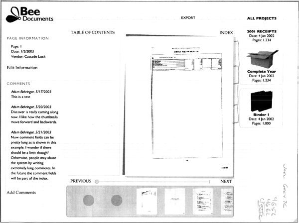
Previously, I discussed the redesign of my document management software from a table-centric design that was easy to program to a document-centric design that is easier for users.
What I liked about the redesign was that the most important thing, the document, was now in the center of the screen. We also give some context to the document by showing its position in the organizational hierarchy (for example, it came from a binder that was in the box labeled "2003"). Also, by using the page browsing metaphor, a customer does not need to add coding data in order to start working with their documents.

The next step was to create a computer rendering of the design. This image was created with various Adobe tools and gave me a more realistic look at the proportions and layout that I would use. The design shown here had several faults. For example, displaying the document groups at the top of the screen limited the amount of room to display pages, most of which are in a portrait orientation. I also wanted to fit thumbnails of the pages across the bottom of the screen and did not want the users to have to use a scroll-bar in order to view the whole user interface. Also, this interface had a lot of boxes which make it harder for the eye to quickly identify the document which is also a rectangle.
Here is the next revision. You can see that I eliminated the boxes around the comments and page information as well as the box around the documents. I also moved the document groups to the right side and added the thumbnails to the bottom of the page. I also worked entirely in grayscale at this point as I wanted to approach color as its own user interface element and did not want to get used to anything yet.
Next blog, I will talk about the all important color selection process.
Labels: design, discover, document management