
Designing Discover - Part 4
Friday, May 27, 2005
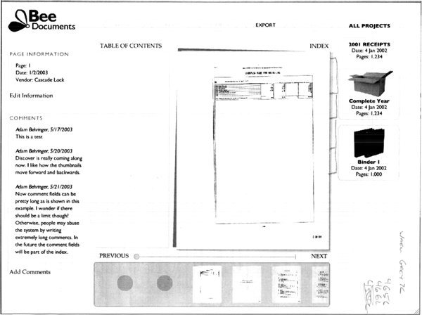
A primary color goal was for the software to feel very comfortable and nature based, not high tech. Our logo has a graphic of bee which has a little yellow on it, so I wanted the document management interface to feel like a field of yellowish green grasses that a Bee might land on. I also made the decision to be very stingy with the colors white and black. We would reserve these colors for items that require the users center of attention.

After I had a basic philosophy for the color palette, it was time to get out the Pantone Chips. I always like to pick colors away from my computer, preferably outdoors. Especially when selecting a natural palette, it is best to be influenced by the colors of nature, and not the colors of technology. Of course, I always check the colors on the multiple computer monitors before making a final decision, but I like to start with the pantone chips in a natural environment.
We picked a palette that included a handful of related colors, with a color for each function. White was reserved for documents or important text fields, black was reserved for the most important text, which in most cases is text related to the current document. There are several natural greens and tans including: a color for the background, a color for user interface elements that can be clicked, one for user interface elements that can't be clicked, a color for static elements such as lines and boxes. All of the colors are very similar because this provides a harmonious look. It also leaves the high contrast colors to the documents themselves which are the star of the show. In a similar way, we avoided using square rectangles in the interface except for the document pages. All the other buttons and boxes have rounded corners.

After all the colors were chosen from the pantone chips, I applied the colors to the interface, made some final tweaks, and it's done. The screenshot above shows the final color selection. If you want to see the interface in action, give Bee Docs' Discover a spin with the on-line demo account.
Labels: design, discover, document management
0 Comments:
Post a Comment
<< Home