
Better Depth in Timeline 3D
Tuesday, August 27, 2013
We are announcing some exciting new features in the upcoming version of Timeline 3D for iOS 7.
We also improved the features that you are using already.
Most importantly, we improved the way that your timelines look and the feeling of depth in a 3D presentation. These improvements will make your timeline more beautiful and easy to read, both on your device screen as well as when connected to an external display.
“Depth” is a key concept that Apple has been pushing for iOS 7. There are two main features I've added which will increase the feeling of depth for your timeline presentations.
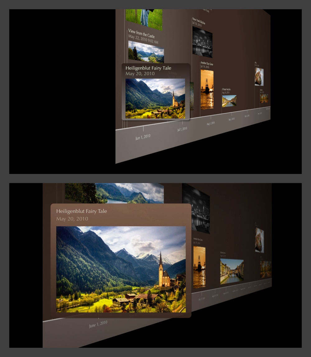
Lighting — The Mac version of Timeline 3D implemented lighting and shading several years ago, but the iOS version has used constant shading to date. In the new version of Timeline 3D for iOS, I've designed a new lighting effect that is a huge improvement over the previous iOS software and is even better looking than the Mac software (we plan to bring these improvement back to the Mac in a future release).
The new lightning effect gives greater emphasis to the highlighted event and enhances the feeling of depth in the overall timeline by brightening that event and shading the background.
In the Mac version, we accomplish a similar effect by multiplying a vignette effect over the timeline. This causes the image to darken around the edges. We vary that effect as the timeline is rotating, so it tricks your eye into believing that the shading is caused by lights. This method is a very fast way to simulate lighting.
However, the layering approach has some technical downsides. First, the selected event can not fill a large percentage of the screen without also being affected by the vignette. Also, the vignette does not work as well at portrait aspect ratios or long and skinny aspect ratios (it is optimized for Mac screen sizes). Finally, the vignette can not work along the sharp edge of an event, so we lose an opportunity to make the selected event “pop” off the background.
For the new iOS 7 release, I calculated the trigonometry to do the actual lighting that we desire. We want the selected event to be 100% lit, the background to fade to a pre-determined amount when it reaches the right edge of the screen and we also want it to work for all render aspect ratios and all chart aspect ratios.
The trigonometry works, but some devices (like the iPad 3 retina) can not calculate it at 60 frames per second. The iPad can do the calculation at 30 frames per second, but after much soul searching, I had to admit that a consistent 60 frames per second animation is more important than the shading effect.
I was about to give up on the lighting improvements when I learned about a value in OpenGL that is adequate for this calculation and is generated by OpenGL's normal pipeline. I simplified my formulas using this value and now we have a beautiful depth lighting effect that can run at 60 fps, even on the most GPU challenged devices.
Parallax — Have you see the parallax motion effect in Apple's iOS 7 intro video? Pretty cool, huh? It makes the buttons on your home screen stand off the wallpaper. Well, we've leveraged that technology to make your timelines look more 3D too. As your iPhone or iPad moves in your hand, the 3D timeline also shifts subtly to reinforce the feeling of depth.
Since releasing the original version of Timeline 3D for Mac five years ago, I have made dozens of subtle changes to the way 3D timelines are displayed. Nearly every update has contained updates to the 3D display. These were improvements to positioning, movement, lighting, shadows, coloring, lighting, and performance.
Each one of these changes may have been hard to detect on it's own. In fact, I have tried to tune each of them down to be just at the edge of perception. Did you notice any? When the changes are considered as a whole, however, the improvements are obvious.
Consider the comparison image below. The top version is Timeline 3D v2 for Mac OS X, the version that was recognized at the Apple Design Awards in 2008. The bottom version was generated on an iPhone with the upcoming version of Timeline 3D for iOS. Click on the image to view it at full size.
Labels: design, ios7, OpenGL, timeline 3D
iOS 7 – Less Volkswagen, more Vanity Fair
Monday, August 19, 2013
In a few weeks Apple will be launching iOS 7. We will be releasing a brand new version of Timeline 3D, redesigned specifically for iOS 7. I wanted to share some thoughts on what the new design direction from Apple means to me.
There has been a lot of talk about new icons, thin fonts, and inspiration from other platforms. To me, these discussions are interesting in the way that Beyonce’s new haircut is interesting, but they are not the main point.
Do you remember the web in the early 90’s? Text content was king, hyperlinks were blue with underlines, and images were reserved only to those that were important to the content.
To me, Apple is encouraging us to look back to those design values. Going back even further, think of books that only use one well-chosen font, in black, on one well-chosen paper, in white, laid out with well-chosen spacing. The goal is that you will get lost in the story and forget that everything you see was carefully designed.
iOS 7 feels retro to me, and I like it. It has been fun to reexamine Timeline 3D over the past few months with this throw-back lens.
In iOS 7, I am less likely to be inspired by the dashboard of a Volkswagen, or the EQ sliders on my boombox.
I am more likely to be inspired by the layout of a Vanity Fair magazine or a small-press edition of a classic novel.
iOS 7 emphasizes:
- Font choices
- Positional Layout
- Color-coded meaning
- Movement
- App Functionality
- Just-in-time adaptable layouts
- Coherence across the system
iOS 7 deemphasis:
- Real-world metaphors
- Material simulation
- Color for decoration
- Designing for screenshots
- Fixed layouts
- Individualistic Style
That isn’t to say that all these things were not important before, and that all these things won’t have a roll to play going forward. But, iOS 7 makes a clear call for a change in emphasis.
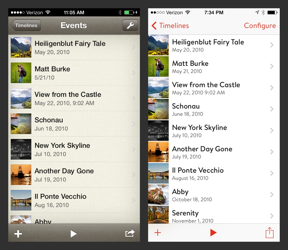
Here are some iPhone examples of how I have redesigned Timeline 3D using these concepts as a guide. My opinion is that the new design is more useful, more efficient, and more beautiful. I hope that you will love it too!

Introducing Matt Nuffort, CEO
Monday, August 12, 2013

I am very pleased to introduce Matt Nuffort. Matt will be joining BEEDOCS as my business partner and will take the role of CEO.
Matt has a huge variety of experience starting with engineering degrees at Princeton and MIT. He's had successes at a 2-person startup, an avionics company for private aircraft, the U.S. military, and most recently as a Senior Product Manager at Amazon, working in the areas of print on demand and independent publishing.
Matt also has some extreme hobbies, cycling from coast-to-coast across the US, flying, and Ironman triathlon. His favorite pastime, however, is sailing with his wife (also accomplished in business and sport) in search of sunsets, blue water, and interesting clouds.
At BEEDOCS, Matt will take leadership of business and customer relations, while Adam will provide leadership in product design and development. We have ambitions to build beautiful products and a beautiful business that will change people's lives for the better.
We've hit the ground running, and you can expect announcements from us very soon. You can follow us on our e-mail mailing list, Twitter, Facebook, or this blog. So grab a font row seat and hold on!
Labels: announcement, beedocs, ceo, matt nuffort