
iOS 7 – Less Volkswagen, more Vanity Fair
Monday, August 19, 2013
In a few weeks Apple will be launching iOS 7. We will be releasing a brand new version of Timeline 3D, redesigned specifically for iOS 7. I wanted to share some thoughts on what the new design direction from Apple means to me.
There has been a lot of talk about new icons, thin fonts, and inspiration from other platforms. To me, these discussions are interesting in the way that Beyonce’s new haircut is interesting, but they are not the main point.
Do you remember the web in the early 90’s? Text content was king, hyperlinks were blue with underlines, and images were reserved only to those that were important to the content.
To me, Apple is encouraging us to look back to those design values. Going back even further, think of books that only use one well-chosen font, in black, on one well-chosen paper, in white, laid out with well-chosen spacing. The goal is that you will get lost in the story and forget that everything you see was carefully designed.
iOS 7 feels retro to me, and I like it. It has been fun to reexamine Timeline 3D over the past few months with this throw-back lens.
In iOS 7, I am less likely to be inspired by the dashboard of a Volkswagen, or the EQ sliders on my boombox.
I am more likely to be inspired by the layout of a Vanity Fair magazine or a small-press edition of a classic novel.
iOS 7 emphasizes:
- Font choices
- Positional Layout
- Color-coded meaning
- Movement
- App Functionality
- Just-in-time adaptable layouts
- Coherence across the system
iOS 7 deemphasis:
- Real-world metaphors
- Material simulation
- Color for decoration
- Designing for screenshots
- Fixed layouts
- Individualistic Style
That isn’t to say that all these things were not important before, and that all these things won’t have a roll to play going forward. But, iOS 7 makes a clear call for a change in emphasis.
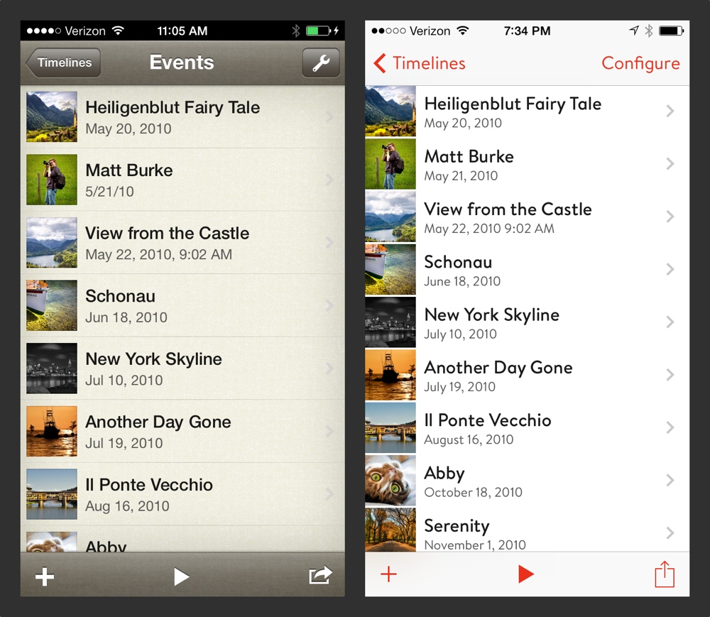
Here are some iPhone examples of how I have redesigned Timeline 3D using these concepts as a guide. My opinion is that the new design is more useful, more efficient, and more beautiful. I hope that you will love it too!

5 Comments:
The design is a much improvement and I congratulate you for that. One detail, why red color on your font? Red is such an emotional hue, with emphasis in 'alertness' 'caution' and one that my eye tries to avoid at all cost. Have other hues being considered?
Gus, thank you for your kind words on the layout improvements.
The red tint (based on PANTONE Warm Red) is the same red used in our logo and app icon. Using the same color scheme as the icon helps you feel like the app and it's icon are connected as iOS 7 animates between apps.
I do understand your concern about the connotations of red as an action color. Please note that several of Apple's most common apps, including Calendar and Music, also use red as an action color.
To my eye, they look nice and bring back that feeling of black, white, and red printed materials. For example, I always like letterpress books that use those three colors together.
Also, when I mentioned being inspired by print design... The most recent Vanity Fair magazine that I reviewed uses red for the headlines. And the latest Martha Stewart Living magazine that I have at the office uses bright red for the headline on the cover page...
If the design trend continues, perhaps it will be less shocking as time goes on.
Great thoughts, and a good looking sample event.
Interesting design, but red text is a huge problem for the 15% of us men who are red green colour blind. We find it often impossible to tell red from green, or identify the differences between all those colours in the blue area, like turquoise, violet, indigo, purple.
Red fades for us when in combination with any other colour. Creates all sorts of problems. The number of colour blind people is increasing, and these problems will become more important.
ManchePaul, thank you for your comments. I wonder how iOS 7 as a whole will work for color blind people. There is a lot of color used to convey meaning in all apps as well as apps that use red for actions...
Have you tried Voice Over? I've worked to make Timeline 3D work well with that feature and it is pretty neat. It might be particularly effective for those who have enough vision to see the layout of the screen, but could use help finding the next action to take.
Besides using color to distinguish action, I've also tried to adapt very standard positions for actions. For example, the upper left button always takes you back (or you can swipe back on iOS 7).
When there is a decision to make, the default action is always bold and usually at the upper right. Actions that interrupt or delete something are usually centered at the bottom of the screen.
I also want to highlight our support for dynamic text in iOS 7. This means that the font size can be cranked up to a large size for all apps that support it. In Timeline 3D, we are using custom fonts, but we are still respecting your size preferences as you set them in the System Preferences.
Hopefully these design decisions will reinforce the use of color for users who can see the color and will make the app usable for those who cannot.
Post a Comment
<< Home